I'm fond of hearing memories that people tell me. I wanted to take personal discoveries that people once believed to be true and document them by putting them in a book.
— UPDATE —
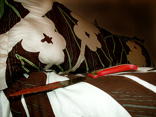
Here is the current layout. I have some ideas for the last couple shots. Do you all have any ideas for the cover shot?
Also, offer still stands with models. It can be ANYBODY. (352) 817- 9854
Very creepy! I think the bed comforter takes away from the knife. Maybe you should try placing the knife on a solid color comforter. Good start! Can't wait to see more!
This is a neat idea. I had a hard time understanding the artist statement at first but as soon as I saw the two pages for your book I got it right away. The picture of the knife bugs me a little bit though. Maybe if the comforter was a different color like caitlin suggested or we saw a different view/angle of the knife it would look better. Just play around a little bit. Great idea though!
white sheets maybe? although the comforter is so nice in the photo, the bloody knife was confusing. the text is awesome. can't wait to see more and now i want carrot cake.
The picture could be stronger if the knife was on a solid color, like a white sheet. The patterns on the comforter are taking away from the creepiness of the knife [which I love!]. I really like this series and I think it will be very interesting to see what else you do.
I dunno-- I am the odd man out here, as I feel that the top image is great. It feels like a real living room sofa with this pristine sharp and otherwise clean object if not for the red. I dig it. Perhaps take more shots so you can choose from a range, but dont shy too far fom pattern, I think it is OK to work for "it" a little bit.
Your story is great. Careful changing up fonts from story to story, unless you emphasize that the choice of font represents a shift in author. Try a couple of different versions.
i would say something that will need the most attention is the writing. i know you have a "rough draft" up, so i cant say too much. just make sure to give the writing the same attention as the photos.
Very creepy! I think the bed comforter takes away from the knife. Maybe you should try placing the knife on a solid color comforter. Good start! Can't wait to see more!
ReplyDeleteThis is a neat idea. I had a hard time understanding the artist statement at first but as soon as I saw the two pages for your book I got it right away. The picture of the knife bugs me a little bit though. Maybe if the comforter was a different color like caitlin suggested or we saw a different view/angle of the knife it would look better. Just play around a little bit. Great idea though!
ReplyDeleteDanielle Otos
This comment has been removed by the author.
ReplyDeletethis is creepy! but as first time, it is quite have time to figure out that is a knife with blood.
ReplyDeletewhite sheets maybe? although the comforter is so nice in the photo, the bloody knife was confusing.
ReplyDeletethe text is awesome. can't wait to see more and now i want carrot cake.
I think this is a nice idea. Will you just be using your personal experiences or will you ask others to contribute as well? :)
ReplyDeleteThe picture could be stronger if the knife was on a solid color, like a white sheet. The patterns on the comforter are taking away from the creepiness of the knife [which I love!]. I really like this series and I think it will be very interesting to see what else you do.
ReplyDelete-Sarah Whitfield
Nick Miller: I like your use of colors to emphasis some sort of metaphor or feeling toward the subject matter on hand.
ReplyDeletethe composition of the first photo is really strong. i did not see the knife until i read the text. interesting idea.
ReplyDelete-alex-
I know you said this wasn't ready. I had to look at the photo for a while to decipher is meaning. But, I love your stories!
ReplyDeleteElaine
I dunno-- I am the odd man out here, as I feel that the top image is great. It feels like a real living room sofa with this pristine sharp and otherwise clean object if not for the red. I dig it. Perhaps take more shots so you can choose from a range, but dont shy too far fom pattern, I think it is OK to work for "it" a little bit.
ReplyDeleteYour story is great. Careful changing up fonts from story to story, unless you emphasize that the choice of font represents a shift in author.
Try a couple of different versions.
NICE!!! EXCITED!!!
Val
This is a great book idea, getting playfull with it could come out really great.
ReplyDeletei would say something that will need the most attention is the writing. i know you have a "rough draft" up, so i cant say too much. just make sure to give the writing the same attention as the photos.
ReplyDeleteI think this is such a neat idea. I really like it and I am looking forward to seeing more of your images.
ReplyDelete