I'm fond of hearing memories that people tell me. I wanted to take personal discoveries that people once believed to be true and document them by putting them in a book.
— UPDATE —
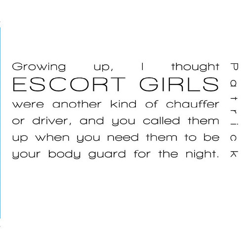
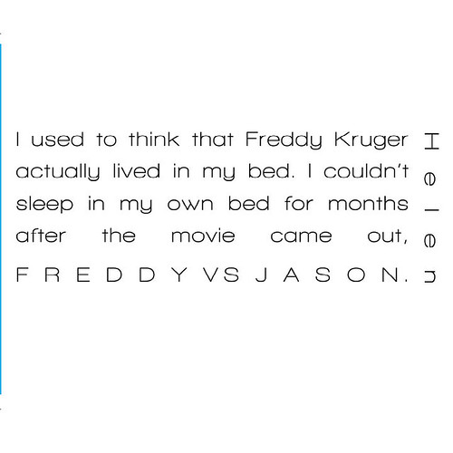
Here is the current layout. I have some ideas for the last couple shots. Do you all have any ideas for the cover shot?
Also, offer still stands with models. It can be ANYBODY. (352) 817- 9854
I am totally digging the font and the layout on both sides of the spread. I do not feel, however, that we need the large page numbers. I understand that compositionally it feels like something might need to be there, but I think the absence of that material would be less distracting than the presence of it. Try repeating the top info again, or putting the persons' name there instead.
I do feel that the amount of white space that you have on the cover is a bit more balanced than what you have in the interior, so keep nudging around that white space just a bit and playing with that banner text up top. It might solve the problem of the page numbers.
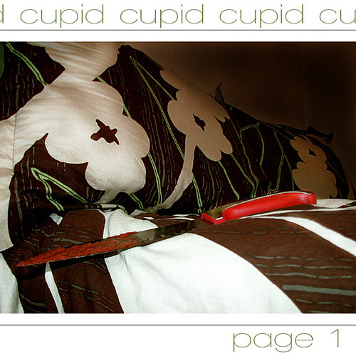
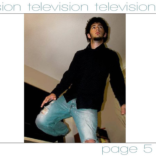
Also think about making all of your photos landscape, as they look better in your layout. I also think that you can have a stronger photo for that television story. it is hard to tell what that guy is doing and he looks too "normal" to be an actor, ya know.
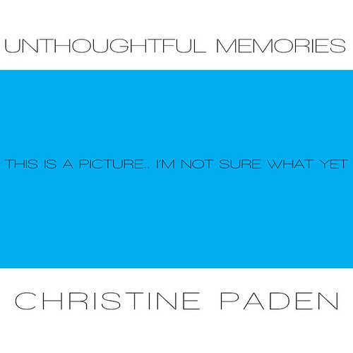
I don't think this is your final title--unthoughtful connotes negative associations (stupid, absentminded) and these memories are not those, they are actually quite innocent and creative mini-stories. You have set this up like a savy childrens book, with illustrations on the left and big lettering on the right. Work with it. It is working for you.
Don't get discouraged,I know I am blabbing alot. You have already begun to nail down so much of the hard stuff! It is going to look great!!!
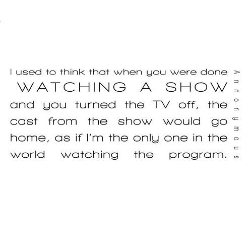
I like the font you have chosen. It's kind of hard to see that the guy is coming out of the tv and I agree with Val on the page numbers. I don't think you really need them. I can't wait to see the images you choose for the other stories!
I really like your choice of font and the way you've laid everything out. It has a very clean look to it, I agree though that the pages don't need to be numbered. I kind of want to see the picture with the guy coming out of the tv in a landscape format to match the 1st page but that's just the part of me that wants everything to be standard. lol! So just keep at it because it's looking really good. :)
if the text including the person's "story" on the right is going to be a lighter typeface, maybe use a bolder version of the same font on the left that contains the title of that particular story. id avoid use the same exact typeface style, but use the same font. Ex: if you had helvetica light for the story, use helvetica or helvetica bold for the headline. im not saying use helvetica tho. how many times can i say helvetica? also, i agree w/ val, scratch the page numbers
I really like your layout! Its very simple and clean! I agree with everyone else on the page numbers, I don't think they are really necessary. I don't think the wording above the photo is necessary either. But I love the text and the way the pages are written! I can't wait to see more pics of these strange memories! :D
Looking good girl!! Layout is very nice! I would try putting the person's name in a different location. I think it looks to jumbled up next to the text.
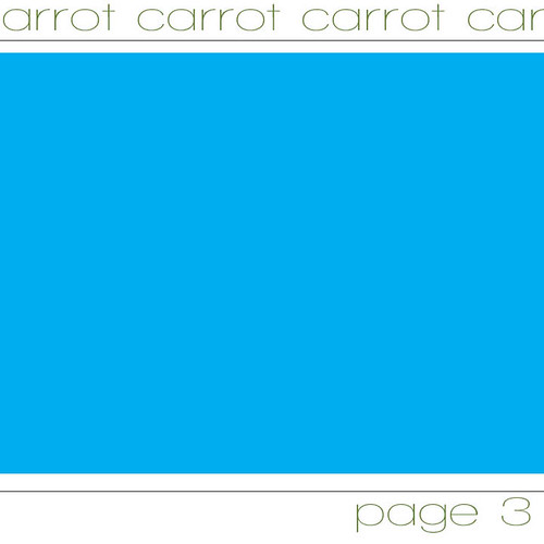
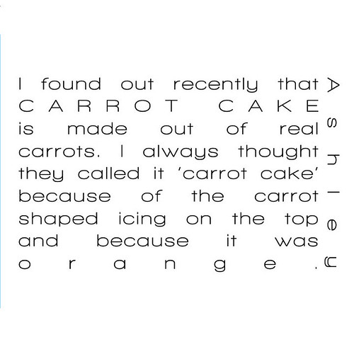
I am very attracted to the font/layout/color combo. It's very slick in a Miami or LA photo studio shoot way. What if for the carrot cake you went to J's Bakery and shot one of their carrot cakes. It's so dingy yellow dirty and might turn out pretty.
i like the layout, except for the large page number. it is a little distracting. the book size seems like it will work well, the square format will definitely be a strong point for the layout.
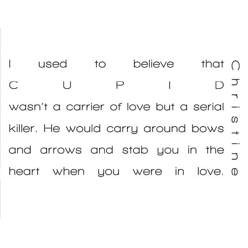
when i was little i thought that there were beings/ghosts in the dark and that if i lay perfectly still under my blanket they would not know i was there. i also lined my be with teddy bears so they could protect me.
The layout of your book looks really nice. I like the picture on one page and then the text on another. I'm not crazy about the title of the book. I can't think of any suggestions right now. Layout looks pretty good though so far.
The title does put me on the defense, waiting for a negative story. The font is nice and clean, but the justified pages go against my training (blame it on government politics).
I agree that the person's name should be moved to make the story more easily viewed. No need for page numbers.
I like your overall idea, I think it works well. I definitely am enjoying reading through your artist book and looking at the photos. Keep up the hard work.
wow, i love it! ur text works so well with the whole concept of the book. ur pics and stories also work great together. i like that ur going to make ur book a perfect square shape!
Great start! Excellent! What size is your book?
ReplyDeleteI am totally digging the font and the layout on both sides of the spread. I do not feel, however, that we need the large page numbers. I understand that compositionally it feels like something might need to be there, but I think the absence of that material would be less distracting than the presence of it. Try repeating the top info again, or putting the persons' name there instead.
I do feel that the amount of white space that you have on the cover is a bit more balanced than what you have in the interior, so keep nudging around that white space just a bit and playing with that banner text up top. It might solve the problem of the page numbers.
Also think about making all of your photos landscape, as they look better in your layout. I also think that you can have a stronger photo for that television story. it is hard to tell what that guy is doing and he looks too "normal" to be an actor, ya know.
I don't think this is your final title--unthoughtful connotes negative associations (stupid, absentminded) and these memories are not those, they are actually quite innocent and creative mini-stories. You have set this up like a savy childrens book, with illustrations on the left and big lettering on the right. Work with it. It is working for you.
Don't get discouraged,I know I am blabbing alot. You have already begun to nail down so much of the hard stuff! It is going to look great!!!
Val
Oh! The book is 10X10"
ReplyDeleteI like the font you have chosen. It's kind of hard to see that the guy is coming out of the tv and I agree with Val on the page numbers. I don't think you really need them. I can't wait to see the images you choose for the other stories!
ReplyDelete-Sarah Whitfield
I agree with everything that was said all in all these layouts are very interesting.
ReplyDeleteI really like your choice of font and the way you've laid everything out. It has a very clean look to it, I agree though that the pages don't need to be numbered. I kind of want to see the picture with the guy coming out of the tv in a landscape format to match the 1st page but that's just the part of me that wants everything to be standard. lol! So just keep at it because it's looking really good. :)
ReplyDeleteif the text including the person's "story" on the right is going to be a lighter typeface, maybe use a bolder version of the same font on the left that contains the title of that particular story. id avoid use the same exact typeface style, but use the same font. Ex: if you had helvetica light for the story, use helvetica or helvetica bold for the headline. im not saying use helvetica tho. how many times can i say helvetica? also, i agree w/ val, scratch the page numbers
ReplyDeleteI really like your layout! Its very simple and clean! I agree with everyone else on the page numbers, I don't think they are really necessary. I don't think the wording above the photo is necessary either. But I love the text and the way the pages are written! I can't wait to see more pics of these strange memories! :D
ReplyDeleteLooking good girl!! Layout is very nice! I would try putting the person's name in a different location. I think it looks to jumbled up next to the text.
ReplyDeleteI am very attracted to the font/layout/color combo. It's very slick in a Miami or LA photo studio shoot way.
ReplyDeleteWhat if for the carrot cake you went to J's Bakery and shot one of their carrot cakes. It's so dingy yellow dirty and might turn out pretty.
i like the text and the color. but your font is so simple. i don't know. it was just my thought.
ReplyDeleteI enjoy the text at the top. Your idea is very youthful, I'm enjoying it a lot. you layout works well, and I agree that the numbers should go.
ReplyDeletei like the layout, except for the large page number. it is a little distracting. the book size seems like it will work well, the square format will definitely be a strong point for the layout.
ReplyDeletewhen i was little i thought that there were beings/ghosts in the dark and that if i lay perfectly still under my blanket they would not know i was there. i also lined my be with teddy bears so they could protect me.
The layout of your book looks really nice. I like the picture on one page and then the text on another. I'm not crazy about the title of the book. I can't think of any suggestions right now. Layout looks pretty good though so far.
ReplyDeleteDanielle
The title does put me on the defense, waiting for a negative story. The font is nice and clean, but the justified pages go against my training (blame it on government politics).
ReplyDeleteI agree that the person's name should be moved to make the story more easily viewed. No need for page numbers.
Can't wait to read more stories!
Elaine
I like your overall idea, I think it works well. I definitely am enjoying reading through your artist book and looking at the photos. Keep up the hard work.
ReplyDelete--Nick Miller
wow, i love it! ur text works so well with the whole concept of the book. ur pics and stories also work great together. i like that ur going to make ur book a perfect square shape!
ReplyDelete